Real-Time Connections
Surfacing connection risk as it develops, so the operation can step in while problems are still solvable.
Breeze flies many routes only once a day, some just two or three times a week. If a guest misses a Tuesday connection, the next seat to their destination might be Saturday. As the airline grows its connecting network, every missed connection carries real cost: rebooking, accommodation, and a guest whose trip just fell apart.
Monitoring those connections took real manpower: a business-intelligence report exported into a spreadsheet every morning, then worked guest by guest as the day drifted away from it. The Connections Risk Dashboard replaces that workflow with live, flight-level risk visibility, so the team can act while an intervention is still possible: hold a departure a few minutes, or start recovery early.
Reactive by design
Figuring out which connections were at risk took serious manpower. The workflow was manual, daily, and always a step behind the operation.
A snapshot that aged all day. Every morning the team exported the business-intelligence report into a spreadsheet. The data was good at the start of the day, then crept away from reality as the operation unfolded: delays moved arrival times, and the sheet stayed frozen at export time.
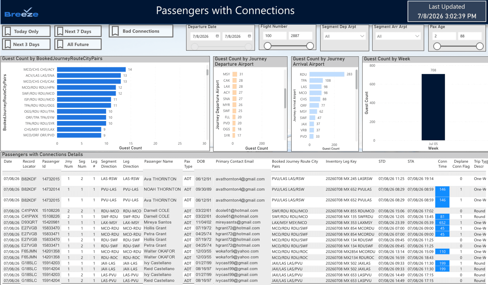
The BI report behind the morning export: aggregate charts over a guest-level detail table. Guest details are fictional.
A wall of guest rows. In the spreadsheet, each row was one guest on one flight, so a day’s list ran long fast. An automated color gradient marked the connection minutes, but at that grain it never added up to a picture: hundreds of rows, and no quick read on which flights actually mattered. Team members worked out the day’s risk by hand, every day.
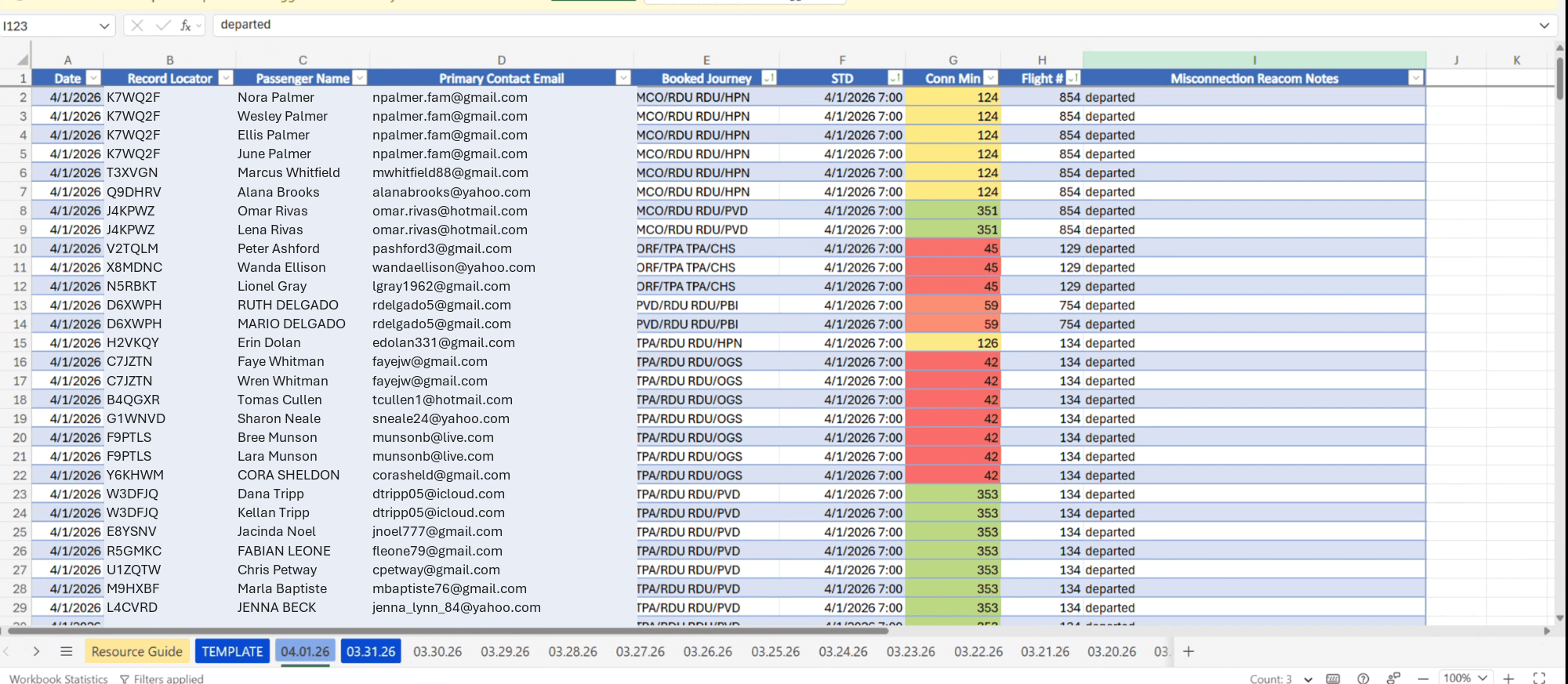
The daily tracking sheet, one tab per day, one row per guest. The automated gradient on connection minutes never made the day much easier to read. Guest details are fictional.
And connections are not optional. They are a growth lever the airline will keep selling, which means the operation has to make them work. The question was never whether to have connections; it was how much manpower knowing their status should cost.
See the risk while it’s still solvable
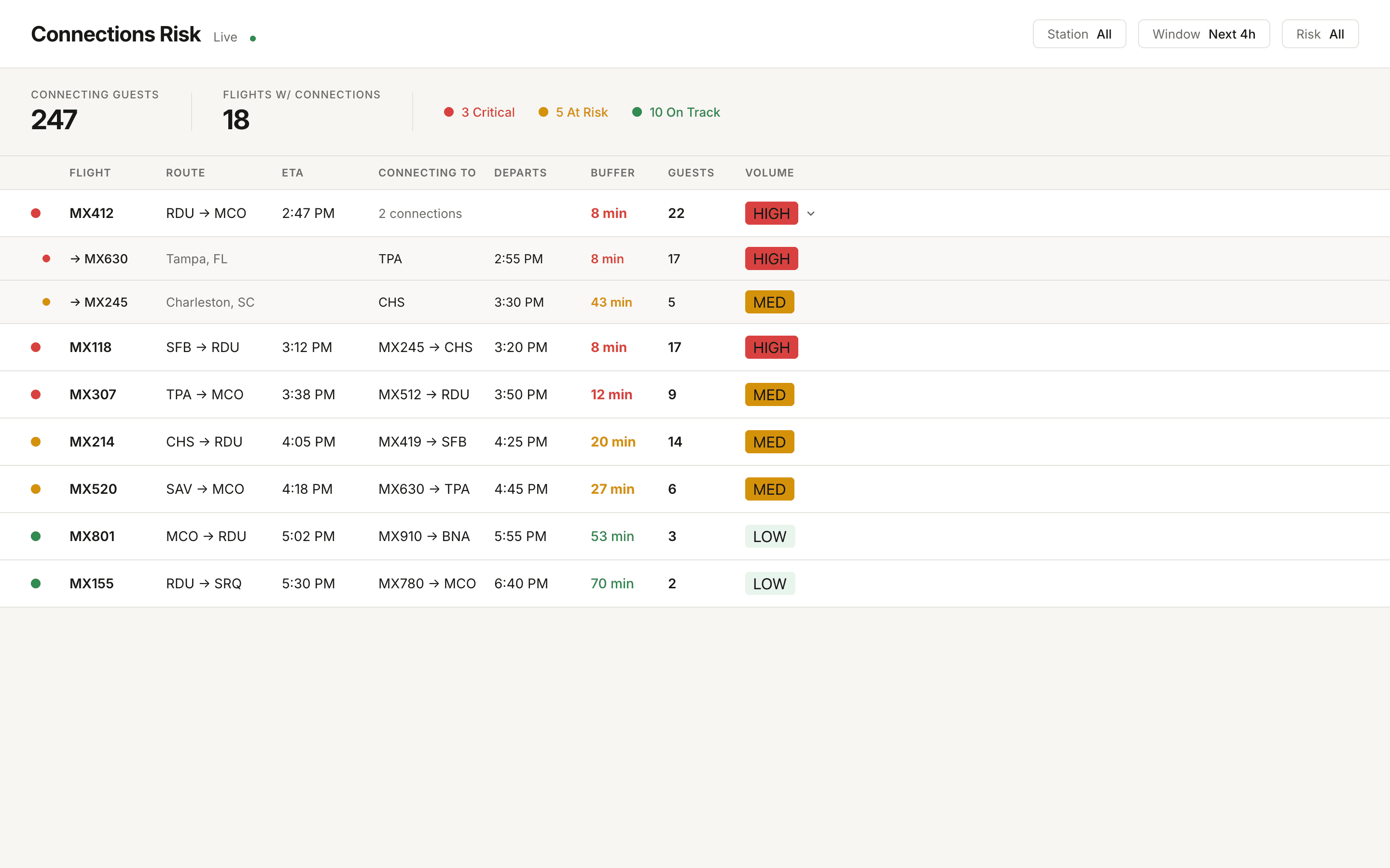
The dashboard scores every inbound flight’s connections by the buffer between estimated arrival and connecting departure, and rolls the operation up into three states: critical (under 15 minutes), at risk (15 to 30), and on track. Summary cards show the system at a glance; one click filters the board to the guests who need attention right now.
Filtering by risk level and expanding a flight to its downstream connections, each with its own time-to-connect and departure status.
Every flight expands in place to show where its guests are headed next: each downstream departure with its own buffer, guest count, bag count, and boarding status. That is the decision view. A team member weighing whether to hold a departure can see exactly who makes it and who doesn’t.
From a wall of rows to a scannable board
Group by flight, not by guest. The spreadsheet listed every guest on every flight, and the sheer length of that list was the workflow’s core problem. The dashboard’s first move is rolling guests up to the flight level: one row per arrival, expandable when the detail matters. Hundreds of guest rows become a board a team member can actually scan.
Volume and risk together. A red flight with twenty-two guests and a red flight with three are different problems. Guest counts, bag counts, and per-destination breakdowns sit next to every risk badge so team members can weigh scale, not just color.
No horizontal scroll, ever. At narrow widths the table reflows into stacked cards instead of scrolling sideways. Off-screen columns are easy to miss, and the primary signal, the risk badge, must never be the thing that gets scrolled away.
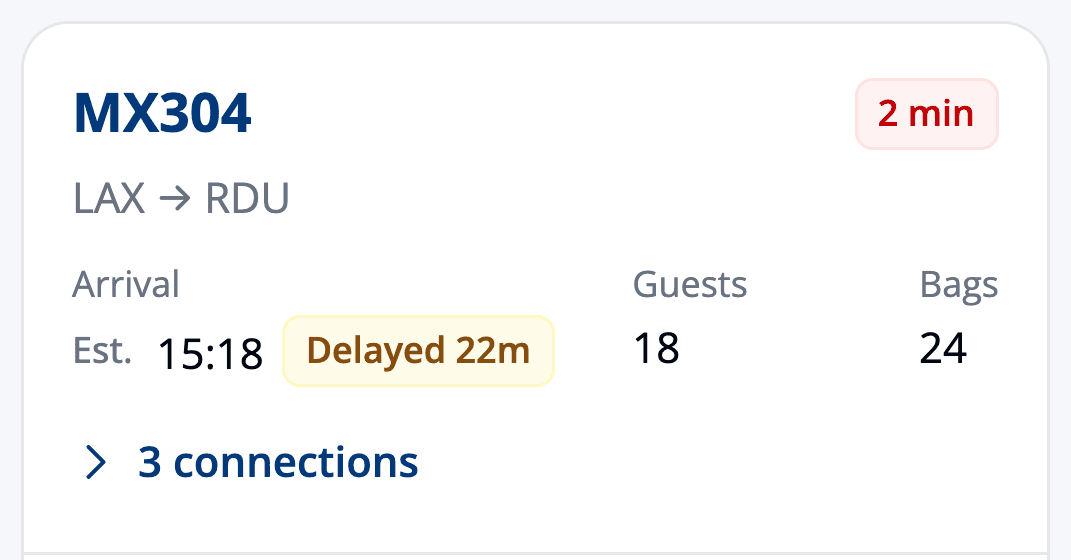
At phone widths each flight rolls up into a card, risk chip first.
Tested with the people who watch connections all day
The dashboard was tested as a React prototype, with real filters and real expanding rows, shared by link with the people who would actually use it: duty managers, guest operations, airport training, program management, product, and a VP. Ten sessions across seven roles ran in roughly a week, and findings from one session were folded into the prototype before the next one ran.
Testing at that pace surfaced the decisions that shaped the product: which columns earn their place, how the summary cards should filter the board, where the station filter matters, and how the board must behave on the hardware people actually carry.
Built AI-first
The project doubled as an experiment in AI-accelerated design. A discovery meeting transcript and the product ticket became a written spec; the same spec then went to three screen-generation approaches in parallel: two AI canvas tools, and Claude Code working directly inside Figma against three years of design system components.
Paper.design: editorial and airy.
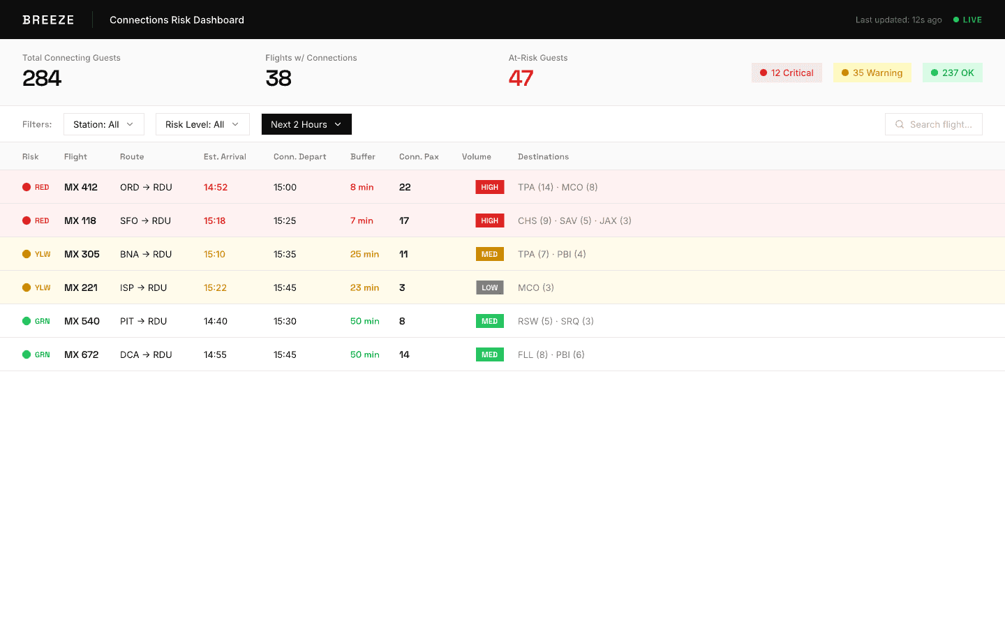
Pencil.dev: denser, ops-console feel.
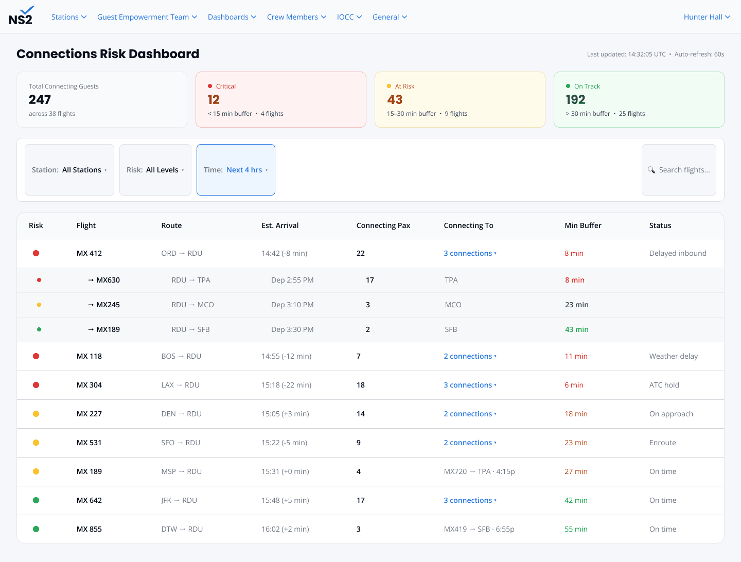
Claude Code + Figma: the winner, built from production design-system components.
The Figma route won on the strength of its foundation, and Claude Code then carried the winning designs out of Figma into the working React prototype that users tested. The practical effect: prototype production stopped being the bottleneck, and the loop between feedback, revision, and the next test closed from weeks to days. The prototype even doubled as dev handoff documentation; engineers read interaction logic out of working code instead of inferring it from static frames.
The measure of this project is the shift it enables: from a team spending real manpower assembling the risk picture by hand, every day, to a board that assembles it continuously. The people who watch connections all day now open a dashboard that tells them where to look first, instead of a spreadsheet that has been drifting from reality since the morning export.
From reactive to proactive: see the problem while it’s still a decision, not a cleanup.
The dashboard has launched to the operation, and the early reception from the people using it has been the best signal of the whole project.
“I’ve had a great experience using the new Connections Risk Dashboard in NS2. It’s intuitive, easy to navigate, and once a few more enhancements are made, it will make my daily tasks much more efficient. The features are well thought out, and they will help streamline processes that currently take much longer. I also appreciate how reliable and responsive it is, always pulling in the most up-to-date information. Overall, it’s been a valuable addition to my workflow, and I look forward to seeing how it continues to evolve with future updates!”
Over time, the record it builds could inform sharper questions too, like how short a connection the airline can sell with confidence.